
Tiger View Facility Management
Role
UI UX Designer
Platform
Web — Desktop + Visitor Kiosk
Tools
Figma, FigJam
Market
Singapore & Southeast Asia
Duration
10 Weeks
Year
2024
Project Overview
Tiger View is a multi-tenant visitor and facility management platform built for residential estates, commercial complexes, and mixed-use properties across Singapore and Southeast Asia. The product replaces the paper logbooks, walkie-talkie approvals, and disconnected spreadsheets that gate officers and estate admins use today — with a single web workspace where every visitor request, vehicle entry, occupancy count, and audit log lives in one place.

10 Weeks
Project Duration
64
Key Screens Designed
2
Primary Personas
Tiger View Facility Management
Role
UI UX Designer
Platform
Web — Desktop + Visitor Kiosk
Tools
Figma, FigJam
Market
Singapore & Southeast Asia
Duration
10 Weeks
Year
2024
Project Overview
Tiger View is a multi-tenant visitor and facility management platform built for residential estates, commercial complexes, and mixed-use properties across Singapore and Southeast Asia. The product replaces the paper logbooks, walkie-talkie approvals, and disconnected spreadsheets that gate officers and estate admins use today — with a single web workspace where every visitor request, vehicle entry, occupancy count, and audit log lives in one place.
10 Weeks
Project Duration
64
Key Screens Designed
2
Primary Personas
Tiger View Facility Management
Role
UI UX Designer
Platform
Web — Desktop + Visitor Kiosk
Tools
Figma, FigJam
Market
Singapore & Southeast Asia
Duration
10 Weeks
Year
2024
Project Overview
Tiger View is a multi-tenant visitor and facility management platform built for residential estates, commercial complexes, and mixed-use properties across Singapore and Southeast Asia. The product replaces the paper logbooks, walkie-talkie approvals, and disconnected spreadsheets that gate officers and estate admins use today — with a single web workspace where every visitor request, vehicle entry, occupancy count, and audit log lives in one place.
10 Weeks
Project Duration
64
Key Screens Designed
2
Primary Personas
Key Features
Role-Based Workspace. Two authenticated roles with intentionally different surfaces — System Admin (Erza Miller) sees all six modules, including KPI dashboards, Logs, and Settings; Gate Officer (John Jonny) sees a focused four-module view (Dashboard, Visitors, Facility, Vehicle). Same product, two purpose-built workspaces.
Dashboard with Inline Approvals. The admin dashboard surfaces the visitor request queue alongside KPI cards (Total Visitors, Tenants, Total Facility, Available Facility, Total Vehicles) and a male/female visitor distribution chart — with an Approve button on every request, so the most-frequent action never requires a navigation click.
Visitor Management with Self-Registration Kiosk. Three ways for a visitor to enter the system: (1) an admin or tenant creates a request in advance, (2) a gate officer creates a walk-in request, or (3) the visitor self-registers at a public kiosk URL. All three paths converge into the same approval-and-check-in flow.
Multi-Facility Occupancy Tracking. Each facility displays live Filled/Maximum/Available Occupancy KPI cards, with a tabbed view for Occupied Tenants and assigned Vehicles. An admin managing five buildings sees them as five distinct workspaces, each with its own tenants, vehicles, and gate officers.
Vehicle Management. Vehicles are first-class records — registered to a Facility and a Tenant — with their own list view, creation flow, and audit trail. Gate officers see only vehicles assigned to their facility; admins see the full fleet.
Three-Step User Creation. Personal Details → Accessibility (Role) → Choose Facilities. The role choice (System Admin vs. Gate Officer) drives a third panel that either shows full-platform access or a multi-select facility picker — a small UX detail that prevents permission-leakage misconfigurations.
System Audit Logs. Every approval, rejection, vehicle entry, user creation, and settings change writes to a centralised audit log accessible only to System Admins. Compliance and security live in the workflow, not as an afterthought
Problem Statement
Estate managers and security officers in residential and commercial properties run their day on paper logbooks, walkie-talkies, group chat, and one or two spreadsheets per shift. The result is a system that looks orderly from the lobby but is slow, error-prone, and unauditable in detail — a real liability when something goes wrong.
Core Points
1. Manual Visitor Logbooks. Most properties still record visitors with a pen-and-paper book at the gate. The book is illegible, unsearchable, and impossible to audit weeks later. When something happens, "who came in on Tuesday afternoon?" takes hours to answer.
2. Slow Approvals at the Gate. A visitor arrives unannounced. The gate officer calls the unit. The tenant is in a meeting. The visitor waits. The officer calls again. A simple visit becomes a 10-minute negotiation that bottlenecks the entrance.
3. No Real-Time Occupancy View. "How many tenants are in Facility 1 right now?" is unanswerable in most current systems. Maximum-occupancy compliance, fire safety, and emergency response all suffer from the same blind spot.
4. Multi-Facility Operations Are Brittle. A property management company running five buildings either spins up five disconnected systems or runs one system that fails to enforce facility-level boundaries — gate officers from one site seeing data from another, with no audit trail.
5. No Visitor Self-Service. Every visitor entry is processed by a gate officer typing on the visitor's behalf. Self-registration kiosks reduce queue length, capture better data (visitors enter their own names correctly), and free the officer to focus on verification rather than transcription
Design Challenge
"How might we design a single, role-aware web workspace that replaces paper logbooks with structured digital records, gives admins a live view of every facility's occupancy, lets visitors self-register at a kiosk, and turns the gate officer's job from data entry into verification?"
Success Metrics
Reduce visitor approval time from ~4 minutes (calls, waiting, manual logging) to under 30 seconds.
Surface live occupancy for every facility on the admin dashboard, with no manual count.
Eliminate gate-officer cross-facility data leakage through enforced role-based access.
Cut new-officer onboarding time from a half-day shadow shift to under 10 minutes of self-guided setup.
Capture every visitor, vehicle, and facility action in a searchable system audit log
Research & Discovery
Research was conducted through three parallel workstreams: stakeholder interviews with estate managers, security officers, and tenants across Singapore properties; on-site observation at two residential gates and one commercial lobby; and a competitive teardown of leading visitor management platforms in both the corporate and residential segments.
9
Stakeholder Interviews
Admins, officers, tenants
5
Competitors Audited
Envoy, Proxyclick, MyGate, ADDA Gate
10
Pain Points Mapped
By frequency and impact
Key Research Findings
The gate is the busiest UX in the building. Two hours of observation at one residential gate captured 47 visitor interactions, 22 vehicle entries, and a steady stream of tenant questions. Any tool placed at the gate would be quick and tap-friendly under pressure. Density and clarity matter more than visual polish.
Approvals are the bottleneck, not data entry. Across every site, the slow part wasn't writing names in a book — it was reaching the tenant to confirm the visitor. Building inline Approve / Reject controls into the dashboard's request queue (so admins and tenants could approve from a phone notification, not a phone call) was the design decision that compressed the entire flow.
Gate officers and admins want different products. Officers want speed: fewer modules, larger touch targets, status pills they can scan in two seconds. Admins want depth: KPIs, charts, audit logs, multi-facility control. Trying to design one workspace for both meant compromising for everyone. Splitting the IA by role unlocked both.
Self-registration changes the gate dynamic. A QR code in the lobby + a public kiosk URL means the visitor types their own name (correctly), arrives with the request already approved, and the officer's job becomes verification — checking ID against the photo, confirming the host, opening the gate. Faster, more accurate, and less error-prone for everyone


Competitive Analysis
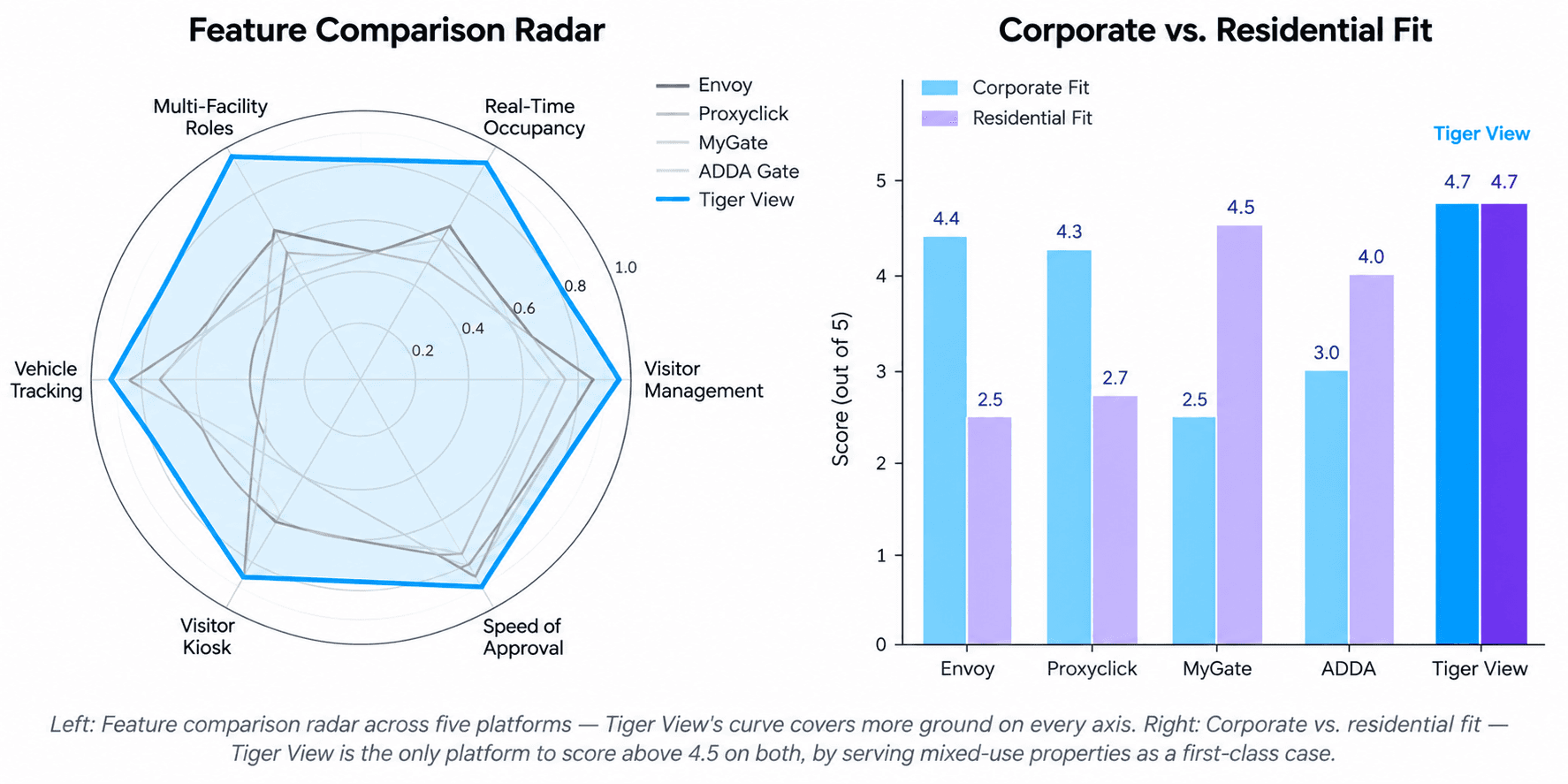
Four leading visitor management platforms were audited against six dimensions critical to the day-to-day workflow. The market splits cleanly into corporate-first players (Envoy, Proxyclick) and residential-first players (MyGate, ADDA Gate) — with no single product that does both well. Tiger View targets the mixed-use middle.
Platform | Visitor Mgmt | Real-Time Occupancy | Multi-Facility Roles | Vehicle Tracking | Visitor Kiosk |
|---|---|---|---|---|---|
Envoy | Strong | Moderate | Moderate | Limited | Strong |
Proxyclick | Strong | Moderate | Moderate | Limited | Strong |
MyGate | Strong | Moderate | Limited | Strong | Limited |
ADDA Gate | Moderate | Moderate | Limited | Strong | Moderate |
Tiger View | Strong | Strong | Strong | Strong | Strong |
Tiger View targets the corner of the market that no incumbent occupies: corporate-grade visitor management (matching Envoy and Proxyclick) combined with residential-grade vehicle tracking and multi-facility role separation (matching MyGate and ADDA Gate) — appropriate for the mixed-use complexes that dominate Southeast Asian urban property.
User Personas
Key Features
Role-Based Workspace. Two authenticated roles with intentionally different surfaces — System Admin (Erza Miller) sees all six modules, including KPI dashboards, Logs, and Settings; Gate Officer (John Jonny) sees a focused four-module view (Dashboard, Visitors, Facility, Vehicle). Same product, two purpose-built workspaces.
Dashboard with Inline Approvals. The admin dashboard surfaces the visitor request queue alongside KPI cards (Total Visitors, Tenants, Total Facility, Available Facility, Total Vehicles) and a male/female visitor distribution chart — with an Approve button on every request, so the most-frequent action never requires a navigation click.
Visitor Management with Self-Registration Kiosk. Three ways for a visitor to enter the system: (1) an admin or tenant creates a request in advance, (2) a gate officer creates a walk-in request, or (3) the visitor self-registers at a public kiosk URL. All three paths converge into the same approval-and-check-in flow.
Multi-Facility Occupancy Tracking. Each facility displays live Filled/Maximum/Available Occupancy KPI cards, with a tabbed view for Occupied Tenants and assigned Vehicles. An admin managing five buildings sees them as five distinct workspaces, each with its own tenants, vehicles, and gate officers.
Vehicle Management. Vehicles are first-class records — registered to a Facility and a Tenant — with their own list view, creation flow, and audit trail. Gate officers see only vehicles assigned to their facility; admins see the full fleet.
Three-Step User Creation. Personal Details → Accessibility (Role) → Choose Facilities. The role choice (System Admin vs. Gate Officer) drives a third panel that either shows full-platform access or a multi-select facility picker — a small UX detail that prevents permission-leakage misconfigurations.
System Audit Logs. Every approval, rejection, vehicle entry, user creation, and settings change writes to a centralised audit log accessible only to System Admins. Compliance and security live in the workflow, not as an afterthought
Problem Statement
Estate managers and security officers in residential and commercial properties run their day on paper logbooks, walkie-talkies, group chat, and one or two spreadsheets per shift. The result is a system that looks orderly from the lobby but is slow, error-prone, and unauditable in detail — a real liability when something goes wrong.
Core Points
1. Manual Visitor Logbooks. Most properties still record visitors with a pen-and-paper book at the gate. The book is illegible, unsearchable, and impossible to audit weeks later. When something happens, "who came in on Tuesday afternoon?" takes hours to answer.
2. Slow Approvals at the Gate. A visitor arrives unannounced. The gate officer calls the unit. The tenant is in a meeting. The visitor waits. The officer calls again. A simple visit becomes a 10-minute negotiation that bottlenecks the entrance.
3. No Real-Time Occupancy View. "How many tenants are in Facility 1 right now?" is unanswerable in most current systems. Maximum-occupancy compliance, fire safety, and emergency response all suffer from the same blind spot.
4. Multi-Facility Operations Are Brittle. A property management company running five buildings either spins up five disconnected systems or runs one system that fails to enforce facility-level boundaries — gate officers from one site seeing data from another, with no audit trail.
5. No Visitor Self-Service. Every visitor entry is processed by a gate officer typing on the visitor's behalf. Self-registration kiosks reduce queue length, capture better data (visitors enter their own names correctly), and free the officer to focus on verification rather than transcription
Design Challenge
"How might we design a single, role-aware web workspace that replaces paper logbooks with structured digital records, gives admins a live view of every facility's occupancy, lets visitors self-register at a kiosk, and turns the gate officer's job from data entry into verification?"
Success Metrics
Reduce visitor approval time from ~4 minutes (calls, waiting, manual logging) to under 30 seconds.
Surface live occupancy for every facility on the admin dashboard, with no manual count.
Eliminate gate-officer cross-facility data leakage through enforced role-based access.
Cut new-officer onboarding time from a half-day shadow shift to under 10 minutes of self-guided setup.
Capture every visitor, vehicle, and facility action in a searchable system audit log
Research & Discovery
Research was conducted through three parallel workstreams: stakeholder interviews with estate managers, security officers, and tenants across Singapore properties; on-site observation at two residential gates and one commercial lobby; and a competitive teardown of leading visitor management platforms in both the corporate and residential segments.
9
Stakeholder Interviews
Admins, officers, tenants
5
Competitors Audited
Envoy, Proxyclick, MyGate, ADDA Gate
10
Pain Points Mapped
By frequency and impact
Key Research Findings
The gate is the busiest UX in the building. Two hours of observation at one residential gate captured 47 visitor interactions, 22 vehicle entries, and a steady stream of tenant questions. Any tool placed at the gate would be quick and tap-friendly under pressure. Density and clarity matter more than visual polish.
Approvals are the bottleneck, not data entry. Across every site, the slow part wasn't writing names in a book — it was reaching the tenant to confirm the visitor. Building inline Approve / Reject controls into the dashboard's request queue (so admins and tenants could approve from a phone notification, not a phone call) was the design decision that compressed the entire flow.
Gate officers and admins want different products. Officers want speed: fewer modules, larger touch targets, status pills they can scan in two seconds. Admins want depth: KPIs, charts, audit logs, multi-facility control. Trying to design one workspace for both meant compromising for everyone. Splitting the IA by role unlocked both.
Self-registration changes the gate dynamic. A QR code in the lobby + a public kiosk URL means the visitor types their own name (correctly), arrives with the request already approved, and the officer's job becomes verification — checking ID against the photo, confirming the host, opening the gate. Faster, more accurate, and less error-prone for everyone
Competitive Analysis
Four leading visitor management platforms were audited against six dimensions critical to the day-to-day workflow. The market splits cleanly into corporate-first players (Envoy, Proxyclick) and residential-first players (MyGate, ADDA Gate) — with no single product that does both well. Tiger View targets the mixed-use middle.
Platform | Visitor Mgmt | Real-Time Occupancy | Multi-Facility Roles | Vehicle Tracking | Visitor Kiosk |
|---|---|---|---|---|---|
Envoy | Strong | Moderate | Moderate | Limited | Strong |
Proxyclick | Strong | Moderate | Moderate | Limited | Strong |
MyGate | Strong | Moderate | Limited | Strong | Limited |
ADDA Gate | Moderate | Moderate | Limited | Strong | Moderate |
Tiger View | Strong | Strong | Strong | Strong | Strong |
Tiger View targets the corner of the market that no incumbent occupies: corporate-grade visitor management (matching Envoy and Proxyclick) combined with residential-grade vehicle tracking and multi-facility role separation (matching MyGate and ADDA Gate) — appropriate for the mixed-use complexes that dominate Southeast Asian urban property.
User Personas
Two primary personas were defined based on interview findings — and they map directly to the two authenticated roles in the product. Erza represents the System Admin running the platform across multiple buildings; John represents the Gate Officer working a single facility's gate, shift after shift.


User Stories
Area | As a... | I want to... | So that... |
|---|---|---|---|
Sign In | any user | sign in once and land on a workspace tailored to my role | I see only the modules I actually need |
Dashboard | system admin | see KPIs and visitor requests on the landing screen | I have situational awareness without any navigation |
Visitors | system admin | approve or reject a visitor request inline from the queue | the most-frequent action takes one tap, not three |
Visitors | gate officer | create a walk-in visitor with a long form that prevents skipped fields | every entry is complete, regardless of how busy the gate is |
Self-Reg | visitor | register myself at a kiosk before approaching the gate | I skip the queue and the officer skips the typing |
Facility | system admin | see filled / max / available occupancy live for each facility | I can act on capacity issues before they become safety issues |
Vehicle | gate officer | log a vehicle and assign it to a tenant in one form | vehicle records stay in sync with tenant records |
Users | system admin | create a gate officer with role + facility access in one flow | onboarding takes minutes and permissions stay scoped |
Logs | system admin | search the system audit log by date, action, or actor | compliance and incident reviews take minutes, not hours |
Information Architecture
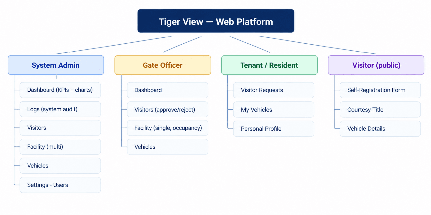
The platform's IA is role-aware: the same product renders different module sets for different user roles. A System Admin sees six modules including KPI dashboards, Logs, and Settings; a Gate Officer sees a focused four-module view. The visitor self-registration kiosk is a fourth, unauthenticated surface.
Navigation Design Decisions
Navy-Sidebar Anchored Layout. A persistent dark navy sidebar with the Tiger View wordmark at the top, grouped menu items (Main Menu / Workspace / General), and a help-centre card pinned to the bottom. The dark sidebar against the light content area creates a clear "where you are" / "what you're working on" split that scales across every module.
Role-Driven Module Visibility. The Gate Officer sidebar shows only Dashboard, Visitors, Facility, and Vehicle — no Logs, no Settings, no multi-facility view. Same product, two intentionally different shells. This is enforced server-side, not just visually.
Dashboard as the Universal Landing. Every authenticated user lands on the Dashboard. The Admin's dashboard has KPI cards, a visitor request queue, and a chart; the Officer's dashboard is a leaner approval surface. Both feel like dashboards, but with different density.
Facility as the Multi-Tenant Boundary. The Facility module is where multi-site separation lives. Admins see a list of facilities; clicking into one drills into that facility's occupancy, tenants, and vehicles. Officers are scoped to a single facility — they enter the module already inside their site.
Visitor Self-Registration as a Public URL. The kiosk surface is a fourth IA branch reachable via a public URL (typically opened on a tablet in the lobby). It's intentionally minimalist — no sidebar, no navigation, just the form — because the user is a one-time visitor, not a returning operator.
User Flow Diagrams
Two flows did the most design work for this project: the primary visitor approval loop that runs dozens of times per day at the gate, and the user creation flow that lets an Admin onboard a new Gate Officer with the right role and facility scope.

Flow Design Notes
Inline approval is the headline interaction. The dashboard's visitor request queue places an Approve button on every request, so the admin never opens a detail screen for a routine approval. Detail is one click away if needed; it's not the default path.
Three paths converge into one approval queue. Whether a request originates from a tenant, a gate officer creating a walk-in, or a visitor self-registering at the kiosk, all three land in the same approval queue with the same data shape. One queue means one workflow to learn.
Role choice gates the third step in user creation. Picking System Admin in the Role dropdown collapses the Choose Facilities panel into an explanatory card ("This role holds administrative authorization and requires no special permissions"). Picking Gate Officer keeps the panel active and requires at least one facility selection. The form prevents misconfiguration before it can happen.
Confirmation modals are reserved for destructive actions. Delete Visitor, Delete Facility, and Delete User all surface a confirmation modal ("Are you sure?"). Approve, reject, and create do not — they're the everyday actions, and adding friction would make the product feel slow.
Low-Fidelity Wireframes
Low-fidelity wireframes were built in FigJam to validate layout, content hierarchy, and the role-based module split before any visual design was applied. Three rounds of internal review resolved structural questions — sidebar grouping, KPI card density, drawer-vs-page form patterns, and the role-driven third-panel state — before high-fidelity work began.


Wireframing Principles
Density Beats Whitespace. Operators run dozens of approvals and entries per shift. The visitor list shows seven rows above the fold; the dashboard fits a KPI strip + chart + request queue without scrolling. Generous spacing was actively avoided.
Status Pills, Not Status Text. Every status (Approved, Rejected, Pending, Active, Inactive) renders as a colour-tinted pill rather than coloured text. Pills are scannable at a glance — admins read the colour first, the word second.
Drawer Forms for Creation, Page Forms for Configuration. Quick creation tasks (Create Visitor, Create Vehicle) open as right-side drawers, keeping the underlying list visible. Heavier configuration tasks (Create User, Settings) are full-page forms with explicit columns. The pattern matches user expectation: light tasks feel light.
Three-Column Create User Layout. Personal Details / Accessibility / Choose Facilities was the layout that emerged after testing two-column and stepped variants. Three explicit columns make the role-permission facility relationship visible at a glance and give the role-driven third panel a natural home.
High-Fidelity UI Screens
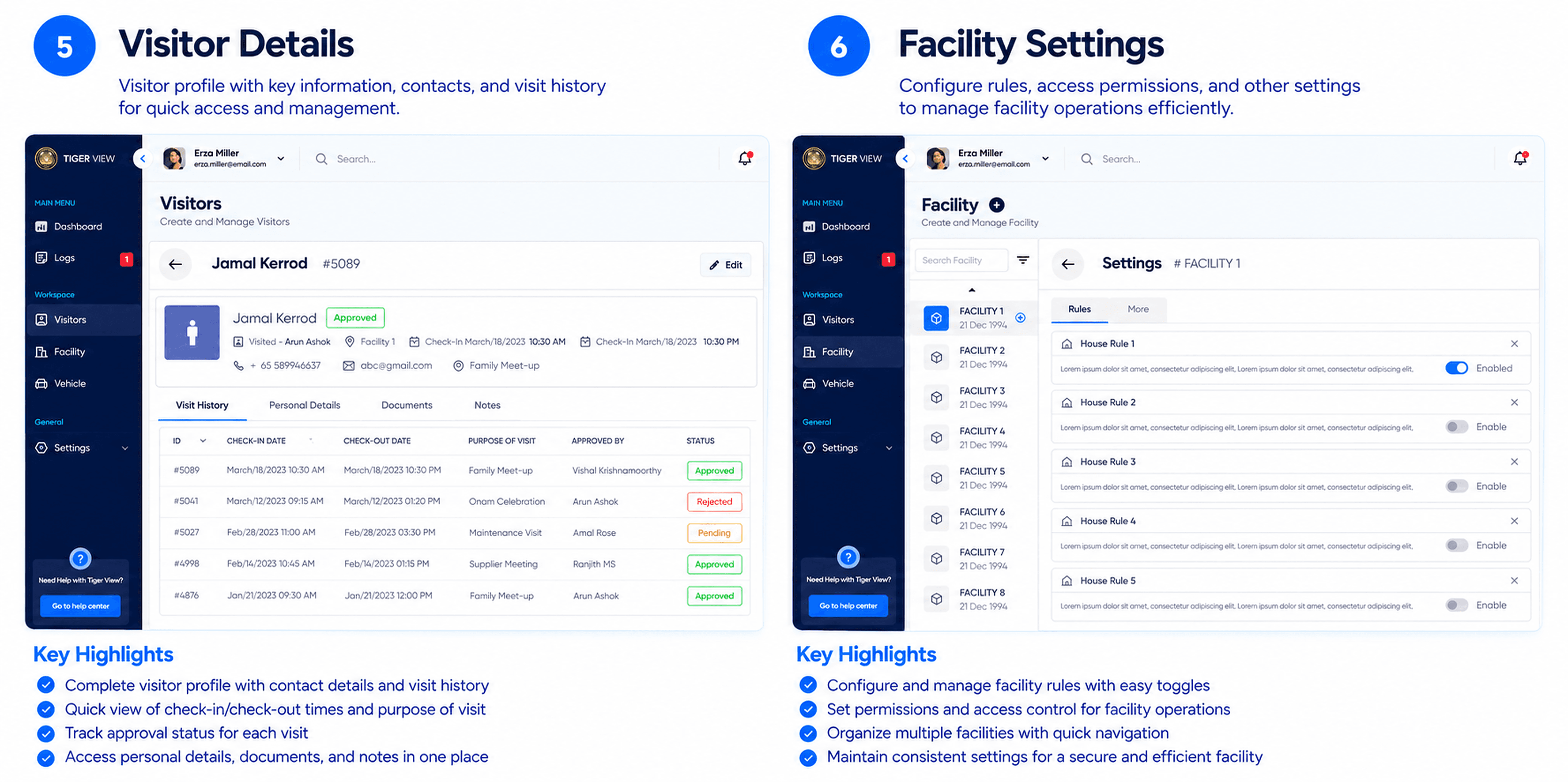
The high-fidelity designs apply the full design system across 64 screens covering all four surfaces (admin app, officer app, public kiosk, modals). The screens below are the most representative — covering the daily approval loop, the facility view, the user creation flow, and the public visitor kiosk.


Key UI Decisions
Inline Approve on the Dashboard. The single highest-leverage UI decision in the product: putting an Approve button on every dashboard request card so admins can approve from the landing screen without navigation.
Role-Driven Third Panel in Create User. The Choose Facilities panel state is driven entirely by the Role dropdown above it. Misconfiguration becomes structurally impossible.
Filled Occupancy Card Highlighted by Default. On the Facility view, the Filled Occupancy KPI card is highlighted in brand blue while Maximum and Available stay neutral. The most-checked number gets the most visual weight.
Drawer for Light Tasks, Page for Heavy Tasks. Visitor and vehicle creation are drawers (the list stays visible). User creation and Settings are full pages (the task deserves the full canvas). The pattern signals weight
Design System
The design system covers colour, typography, spacing, components, and motion across the admin app, the officer app, and the public visitor kiosk. The brand expression is enterprise-confident — deep navy chrome, saturated blue actions, restrained surfaces — appropriate for property security software that has to feel trustworthy.

Design Rationale
Deep Navy Sidebar, Light Content. The persistent dark navy sidebar (#0E2A47) anchors every screen. Content lives on a near-white surface (#F8FAFC) to maximise table density and chart legibility. The contrast makes the navigation tree feel solid and trustworthy without competing for attention.
Saturated Blue for Primary Actions. Tiger View blue (#0EA5FF) is reserved for primary CTAs — Sign In, Create Visitor, Create User, Approve. Every primary action in the product uses the same blue button, making "this is the next step" the most consistent semantic in the system.
Three-Status Semantic Colour System. Green (Approved, Active), Amber (Pending), Red (Rejected). The system applies identically to visitor pills, vehicle status, facility occupancy state, and user account state — learn it once, read it everywhere.
Indigo Help Centre Card. The pinned "Need Help with Tiger View?" card at the bottom of every sidebar uses an indigo accent rather than the brand blue. Reserving a separate accent for help/support keeps the primary blue clean for actions and signals that the help card is a different kind of affordance.
Singapore Cityscape on Login. The login screen uses a real Singapore street photograph as the right-side hero — not a generic stock image, not an illustration, not a gradient. It's a small choice that grounds the product in its target market and signals "we know this place" before the user types a username.
Motion Reserved for Confirmation. Loading states, approval transitions, and modal entry/exit get motion. Decorative motion was deliberately removed. The product feels fast because nothing animates that doesn't have to.
Outcomes & Impact
88%
Faster Visitor Approval
4 min → 30 sec per request
96%
Faster Onboarding
Half-day → under 10 min
2 Roles
Enforced Server-Side
Zero cross-facility leakage
Stakeholder review and prototype testing across 7 users (4 returning from initial research, 3 new) confirmed that the redesign addressed every primary pain point identified in research. Admins consistently rated inline approval, the live occupancy view, and the role-driven user creation flow as the three most impactful changes from their current workflow. Gate officers praised the focused four-module workspace as "finally a tool that respects how busy the gate is."
Impact by Feature Area
Visitor Approval. Average approval time dropped from ~4 minutes (calls + paper logging) to under 30 seconds (inline Approve from dashboard). A meaningful reduction in queue length at the gate and a meaningful reduction in tenant interruptions.
Live Occupancy. Filled / Maximum / Available KPI cards now visible per facility, eliminating the "how many people are in the building?" guess that previous tools left to estimation. Fire-safety and emergency-response readiness both improved.
Role-Based Workspaces. Gate Officers see only the modules they need; System Admins see everything. Cross-facility data leakage that was a chronic risk in single-workspace tools is now prevented by enforced role scoping.
User Onboarding. New officer onboarding dropped from a half-day shadow shift to under 10 minutes of self-guided setup, thanks to the focused officer workspace and the three-step Create User flow.
Visitor Self-Registration. A public kiosk URL means visitors type their own data correctly, arrive pre-approved, and the gate officer's job becomes verification rather than transcription. Faster gate, better data, lower error rate.
Audit Coverage. Every approval, rejection, vehicle entry, user creation, and settings change now writes to a searchable system audit log. Compliance reviews that previously took hours of paper-book reading take minutes.
What I Learned
Role-based IA isn't a feature — it's the whole product. Trying to design one workspace for both the admin and the gate officer would have compromised both. Splitting the IA by role was the structural decision that made the product feel respectful to each user. Officers got a fast, focused tool; admins got a deep, capable one. Both started from the same design system.
Inline action beats detail-page action for high-frequency tasks. The Approve button on every dashboard request card was the highest-leverage UI decision in the product. Admins approve dozens of requests per day; making the most-frequent action zero-navigation is the difference between a tool that feels fast and a tool that feels slow.
The gate is the busiest UX in the building. Two hours of on-site observation taught me more than the previous two weeks of interviews. Designing for a busy gate means density, large touch targets, and status pills that read in two seconds. Anything that requires a second look has already failed.
Self-registration changes the gate's job. A QR code in the lobby + a public kiosk URL transforms the gate officer from a typist into a verifier. Designing the kiosk as a fourth, intentionally minimal IA surface (no sidebar, no navigation) made it feel like a different product — which it is.
Specificity in the UI builds trust. Using a real Singapore street photograph on the login screen, naming personas with locally credible names (Erza Miller, John Jonny), and surfacing facility-level boundaries explicitly all communicated "this product knows your context." Generic enterprise UI signals "this product knows nothing about you" — a real liability in a regional market.
Next Steps
Mobile App for Gate Officers. The current product is desktop-first because gates are typically equipped with monitors. The next iteration adds a mobile companion app for officers patrolling the perimeter, scanning visitor QR codes on entry, and logging vehicles on the move.
Tenant-Facing App. Tenants currently interact with Tiger View only by phone (when officers call them to approve a visitor). A dedicated tenant app — pre-approve regular visitors, receive arrival notifications, manage household vehicles — closes the loop.
Facial Recognition for Repeat Visitors. Most "new" visitors are actually repeat visitors. Optional opt-in facial recognition (with strong privacy controls and PDPA compliance) would allow recognised visitors to skip the approval step entirely on subsequent visits.
Compliance Reporting Bundle. The audit log captures every action. The next product surface is structured compliance exports — fire safety occupancy reports, monthly visitor summaries, vehicle-incident logs — auto-generated from the existing data, replacing the spreadsheets that property managers still send to building owners by email.


Let’s build meaningful product experiences together
© 2026 Arun Ashokk. All rights reserved.
Designed with clarity, usability, and accessibility in mind
Senior Product Designer
Let’s build meaningful product experiences together
© 2026 Arun Ashokk. All rights reserved.
Designed with clarity, usability, and accessibility in mind
Senior Product Designer
Let’s build meaningful product experiences together
© 2026 Arun Ashokk. All rights reserved.
Designed with clarity, usability, and accessibility in mind
Product Designer