
Electronic Logging Device (ELD)
Role
Product Designer
Platform
Mobile
Tools
Figma, FigJam, Balsamiq
Market
USA & Canada
Duration
14 Weeks
Year
2024
Project Overview
Zora ELD is a driver-first mobile application for Electronic Logging Device compliance, built for long-haul truck drivers operating across the United States and Canada. The app pairs over Bluetooth with the in-vehicle Zora Gateway hardware module, reads engine state in real time, and handles the full daily operating loop a driver runs from pre-trip inspection to certified daily log

14 Weeks
Project Duration
70
Key Screens Designed
2
Primary Personas
Electronic Logging Device (ELD)
Role
Product Designer
Platform
Mobile
Tools
Figma, FigJam, Balsamiq
Market
USA & Canada
Duration
14 Weeks
Year
2024
Project Overview
Zora ELD is a driver-first mobile application for Electronic Logging Device compliance, built for long-haul truck drivers operating across the United States and Canada. The app pairs over Bluetooth with the in-vehicle Zora Gateway hardware module, reads engine state in real time, and handles the full daily operating loop a driver runs from pre-trip inspection to certified daily log
14 Weeks
Project Duration
70
Key Screens Designed
2
Primary Personas
Electronic Logging Device (ELD)
Role
Product Designer
Platform
Mobile
Tools
Figma, FigJam, Balsamiq
Market
USA & Canada
Duration
14 Weeks
Year
2024
Project Overview
Zora ELD is a driver-first mobile application for Electronic Logging Device compliance, built for long-haul truck drivers operating across the United States and Canada. The app pairs over Bluetooth with the in-vehicle Zora Gateway hardware module, reads engine state in real time, and handles the full daily operating loop a driver runs from pre-trip inspection to certified daily log
14 Weeks
Project Duration
70
Key Screens Designed
2
Primary Personas
Key Features
Plain-Language Six-Status Duty Grid. A single screen with one tap target for each of the six federal duty statuses. Every tile keeps the standard shorthand drivers already half-recognise — OFF, SB, D, ON, PC, YM — and pairs it with the full label (D — Driving, SB — Sleeper Berth) so the code never has to be memorised. Workflow-aware comment presets (Lunch Break, Load & Drop, Fuel, Cargo Check) take typing out of the most common log entries.
Hardware-Integrated HOS Tracking. Real-time pairing with the Zora Gateway over Bluetooth — engine RPM, speed, odometer, and engine hours feed the duty status and HOS countdown automatically, so the driver confirms rather than calculates.
Dual-Country Compliance. Single-tap switching between U.S. FMCSA Part 395 rules and Canada SOR/2019-165, including Cycle 1 / Cycle 2, North / South, and one-tap cycle reset for cross-border drivers.
Roadside Inspector Mode. One-tap entry into a high-contrast officer hand-off mode supporting all four FMCSA-mandated transfer protocols — Bluetooth, USB, Web Service, Email — with country specific officer flows for both DOT and CVSE.
“How to Fix” Violation Remediation. Each HOS violation card surfaces the rule section, an inline mini-graph of the duty pattern that caused it, and a remediation flow — moving violations from punitive to educational.
DVIR + CTPAT Inspection. Guided pre-trip / post-trip / en-route inspection with NFC trailer-tag scanning, three-tab defect logging (Truck / Trailer / CTPAT) for cross-border loads, and digital signature capture.
Exception & Edge-Case Handling. Dedicated review surfaces for Carrier Edits, Missing Logs, and Unidentified Driving — the messy edges competitors leave to the back office.
Problem Statement
Truck drivers across North America are required by federal mandate to log Hours of Service electronically. But the apps that emerged from the 2017 FMCSA mandate — and its 2021 Canadian counterpart — were built by hardware vendors, with the fleet manager rather than the driver as the assumed user. Two problems follow from that. The apps are designed for the back office instead of the cab, and they are designed for a confident, exploratory smartphone user — which the average long-haul driver is not. The result is a category of products drivers tolerate rather than trust, and quietly work around with paper notebooks and phone calls.
Core Points
Industry Shorthand With No Explanation. Duty statuses, log fields, and transfer protocols are all labelled in trade shorthand — D, SB, ON, PC, DVIR, HOS. No app explains any of it. Drivers learn the codes by trial and error over their first weeks, or by calling a dispatcher mid-shift to ask which one to tap. The interface assumes knowledge the driver is still acquiring.
Built for Confident App Users. Primary actions sit two or three taps deep, behind menus the driver is expected to explore. Drivers report taking their eyes off the road to hunt for a routine status change — a safety problem dressed up as a UX problem.
Overloaded Dashboards Designed for Desktop. Fleet-manager dashboards crammed onto a 6.5-inch phone screen, illegible at arm’s length in a sunlit cab.
Cross-Border Drivers Left to Do the Math. A U.S. 11-hour drive limit against a Canadian 13 hour one; Cycle 1 versus Cycle 2; North versus South. Existing apps either ignore the difference or expect the driver to hold two parallel rule sets in their head.
Reactive, Not Proactive Compliance. Apps announce a violation after it has happened, with no route to remediation — a four-figure fine and a permanent CSA-score hit, delivered as a single red banner.
Hidden Inspector Mode. The flow a driver runs during a roadside stop is buried in settings, sometimes behind a password they don’t remember under stress.
Design Challenge
“How might we design a calm, reliable ELD for drivers who are not confident with technology — one that explains its own language instead of assuming it, makes every high-frequency action a single tap, handles dual-country compliance without mental math, and turns a roadside inspection from a panic moment into a 10-second hand-off?”
Success Metrics
Show every duty status in plain language — no shorthand code ever appears on screen without its full label.
Reduce duty-status change time by 65% (from ~5 seconds to under 2 seconds).
Surface complete status — driver, status, drive remaining, rule, trailer — within 1 second of opening Home.
Cut full DVIR completion time by 60% (from ~4 minutes to under 90 seconds).
Make Inspector Mode reachable in 2 taps from anywhere, with no hidden modes.
Achieve full FMCSA Part 395 and Canada SOR/2019-165 compliance with zero regulatory deviations.
Research & Discovery
Research ran as three parallel workstreams: stakeholder and driver interviews across U.S. and Canadian carriers, a competitive teardown of the four most-used ELD apps, and a regulatory deep-read of FMCSA Part 395 and Canada SOR/2019-165.
12
Driver Interviews
OTR, regional, owner-operator
4
Competitors Audited
Motive, Samsara, Garmin, BigRoad
10
Pain Points Mapped
By frequency and impact
Key Research Findings
Drivers glance, they don’t read. Across all 12 interviews, drivers described checking the app dozens of times per shift but never spending more than a second or two per glance. A screen that has to be read has already failed; the home screen must answer “what do I do next?” almost instantly.
The interface speaks a language drivers are still learning. Every app audited — and every duty log itself — is written in trade shorthand: D, SB, ON, PC, YM. None of the apps explained the codes. Drivers described picking them up the hard way during their first weeks on the job, or calling a dispatcher to ask which status to select. For someone who is not a confident app user, an unexplained two-letter code is not a label — it is a small test that can be failed. This sat underneath the two onboarding-related issues in the priority matrix, “Long Onboarding” and “Weak Help & Support,” and pointed to a fix that would cost almost nothing.
Status changes are the most-frequent action by an order of magnitude. Drivers change duty status 20–40 times per shift. In competitor apps that is two or three taps and a confirmation dialog. Collapsing it to one clearly labelled tap is the single highest-leverage change in the product.
Cross-border compliance is universally underserved. 8 of 12 drivers ran cross-border routes regularly. None used an ELD that switched rule sets automatically; all eight described a workaround involving a paper notebook or a second app.
“How to Fix” beats “you have a violation.” Shown an early prototype that paired each violation with a remediation flow, every driver identified it as the most useful feature in the study. Reactive compliance — a system that says what went wrong but not how to recover — was the most-cited frustration with current tools.


Competitive Analysis
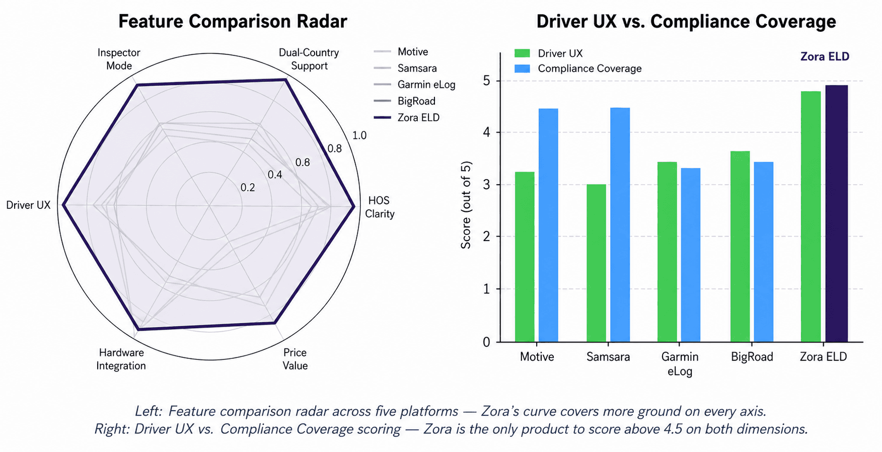
Four leading ELD platforms were audited against six dimensions critical to a driver’s daily experience. The audit found a clear market gap between hardware-led products that bolt a UI on top of telematics and lighter-weight tools that compromise on compliance depth. It also confirmed what the interviews had shown: not one of the four explains its own interface language. Duty statuses, log fields, and transfer protocols are labelled in shorthand the driver is simply expected to already know.
Platform | HOS Clarity | Dual-Country | Inspector Mode | Driver UX | Hardware Integration |
|---|---|---|---|---|---|
Motive | Strong | Moderate | Moderate | Moderate | Strong |
Samsara | Strong | Moderate | Moderate | Moderate | Strong |
Garmin eLog | Moderate | Limited | Moderate | Moderate | Moderate |
BigRoad | Moderate | Moderate | Moderate | Strong | Moderate |
Zora ELD | Strong | Strong | Strong | Strong | Strong |
Zora ELD targets the unoccupied corner of the market: hardware-grade compliance depth, matching Motive and Samsara, combined with driver-first UX in the spirit of BigRoad — plus the dual-country compliance, plain-language labelling, and “How to Fix” remediation that no competitor surfaces.
User Personas
Key Features
Plain-Language Six-Status Duty Grid. A single screen with one tap target for each of the six federal duty statuses. Every tile keeps the standard shorthand drivers already half-recognise — OFF, SB, D, ON, PC, YM — and pairs it with the full label (D — Driving, SB — Sleeper Berth) so the code never has to be memorised. Workflow-aware comment presets (Lunch Break, Load & Drop, Fuel, Cargo Check) take typing out of the most common log entries.
Hardware-Integrated HOS Tracking. Real-time pairing with the Zora Gateway over Bluetooth — engine RPM, speed, odometer, and engine hours feed the duty status and HOS countdown automatically, so the driver confirms rather than calculates.
Dual-Country Compliance. Single-tap switching between U.S. FMCSA Part 395 rules and Canada SOR/2019-165, including Cycle 1 / Cycle 2, North / South, and one-tap cycle reset for cross-border drivers.
Roadside Inspector Mode. One-tap entry into a high-contrast officer hand-off mode supporting all four FMCSA-mandated transfer protocols — Bluetooth, USB, Web Service, Email — with country specific officer flows for both DOT and CVSE.
“How to Fix” Violation Remediation. Each HOS violation card surfaces the rule section, an inline mini-graph of the duty pattern that caused it, and a remediation flow — moving violations from punitive to educational.
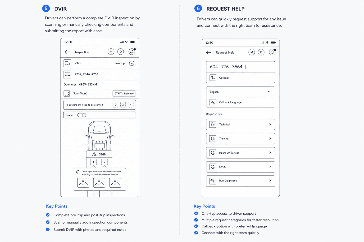
DVIR + CTPAT Inspection. Guided pre-trip / post-trip / en-route inspection with NFC trailer-tag scanning, three-tab defect logging (Truck / Trailer / CTPAT) for cross-border loads, and digital signature capture.
Exception & Edge-Case Handling. Dedicated review surfaces for Carrier Edits, Missing Logs, and Unidentified Driving — the messy edges competitors leave to the back office.
Problem Statement
Truck drivers across North America are required by federal mandate to log Hours of Service electronically. But the apps that emerged from the 2017 FMCSA mandate — and its 2021 Canadian counterpart — were built by hardware vendors, with the fleet manager rather than the driver as the assumed user. Two problems follow from that. The apps are designed for the back office instead of the cab, and they are designed for a confident, exploratory smartphone user — which the average long-haul driver is not. The result is a category of products drivers tolerate rather than trust, and quietly work around with paper notebooks and phone calls.
Core Points
Industry Shorthand With No Explanation. Duty statuses, log fields, and transfer protocols are all labelled in trade shorthand — D, SB, ON, PC, DVIR, HOS. No app explains any of it. Drivers learn the codes by trial and error over their first weeks, or by calling a dispatcher mid-shift to ask which one to tap. The interface assumes knowledge the driver is still acquiring.
Built for Confident App Users. Primary actions sit two or three taps deep, behind menus the driver is expected to explore. Drivers report taking their eyes off the road to hunt for a routine status change — a safety problem dressed up as a UX problem.
Overloaded Dashboards Designed for Desktop. Fleet-manager dashboards crammed onto a 6.5-inch phone screen, illegible at arm’s length in a sunlit cab.
Cross-Border Drivers Left to Do the Math. A U.S. 11-hour drive limit against a Canadian 13 hour one; Cycle 1 versus Cycle 2; North versus South. Existing apps either ignore the difference or expect the driver to hold two parallel rule sets in their head.
Reactive, Not Proactive Compliance. Apps announce a violation after it has happened, with no route to remediation — a four-figure fine and a permanent CSA-score hit, delivered as a single red banner.
Hidden Inspector Mode. The flow a driver runs during a roadside stop is buried in settings, sometimes behind a password they don’t remember under stress.
Design Challenge
“How might we design a calm, reliable ELD for drivers who are not confident with technology — one that explains its own language instead of assuming it, makes every high-frequency action a single tap, handles dual-country compliance without mental math, and turns a roadside inspection from a panic moment into a 10-second hand-off?”
Success Metrics
Show every duty status in plain language — no shorthand code ever appears on screen without its full label.
Reduce duty-status change time by 65% (from ~5 seconds to under 2 seconds).
Surface complete status — driver, status, drive remaining, rule, trailer — within 1 second of opening Home.
Cut full DVIR completion time by 60% (from ~4 minutes to under 90 seconds).
Make Inspector Mode reachable in 2 taps from anywhere, with no hidden modes.
Achieve full FMCSA Part 395 and Canada SOR/2019-165 compliance with zero regulatory deviations.
Research & Discovery
Research ran as three parallel workstreams: stakeholder and driver interviews across U.S. and Canadian carriers, a competitive teardown of the four most-used ELD apps, and a regulatory deep-read of FMCSA Part 395 and Canada SOR/2019-165.
12
Driver Interviews
OTR, regional, owner-operator
4
Competitors Audited
Motive, Samsara, Garmin, BigRoad
10
Pain Points Mapped
By frequency and impact
Key Research Findings
Drivers glance, they don’t read. Across all 12 interviews, drivers described checking the app dozens of times per shift but never spending more than a second or two per glance. A screen that has to be read has already failed; the home screen must answer “what do I do next?” almost instantly.
The interface speaks a language drivers are still learning. Every app audited — and every duty log itself — is written in trade shorthand: D, SB, ON, PC, YM. None of the apps explained the codes. Drivers described picking them up the hard way during their first weeks on the job, or calling a dispatcher to ask which status to select. For someone who is not a confident app user, an unexplained two-letter code is not a label — it is a small test that can be failed. This sat underneath the two onboarding-related issues in the priority matrix, “Long Onboarding” and “Weak Help & Support,” and pointed to a fix that would cost almost nothing.
Status changes are the most-frequent action by an order of magnitude. Drivers change duty status 20–40 times per shift. In competitor apps that is two or three taps and a confirmation dialog. Collapsing it to one clearly labelled tap is the single highest-leverage change in the product.
Cross-border compliance is universally underserved. 8 of 12 drivers ran cross-border routes regularly. None used an ELD that switched rule sets automatically; all eight described a workaround involving a paper notebook or a second app.
“How to Fix” beats “you have a violation.” Shown an early prototype that paired each violation with a remediation flow, every driver identified it as the most useful feature in the study. Reactive compliance — a system that says what went wrong but not how to recover — was the most-cited frustration with current tools.
Competitive Analysis
Four leading ELD platforms were audited against six dimensions critical to a driver’s daily experience. The audit found a clear market gap between hardware-led products that bolt a UI on top of telematics and lighter-weight tools that compromise on compliance depth. It also confirmed what the interviews had shown: not one of the four explains its own interface language. Duty statuses, log fields, and transfer protocols are labelled in shorthand the driver is simply expected to already know.
Platform | HOS Clarity | Dual-Country | Inspector Mode | Driver UX | Hardware Integration |
|---|---|---|---|---|---|
Motive | Strong | Moderate | Moderate | Moderate | Strong |
Samsara | Strong | Moderate | Moderate | Moderate | Strong |
Garmin eLog | Moderate | Limited | Moderate | Moderate | Moderate |
BigRoad | Moderate | Moderate | Moderate | Strong | Moderate |
Zora ELD | Strong | Strong | Strong | Strong | Strong |
Zora ELD targets the unoccupied corner of the market: hardware-grade compliance depth, matching Motive and Samsara, combined with driver-first UX in the spirit of BigRoad — plus the dual-country compliance, plain-language labelling, and “How to Fix” remediation that no competitor surfaces.
User Personas
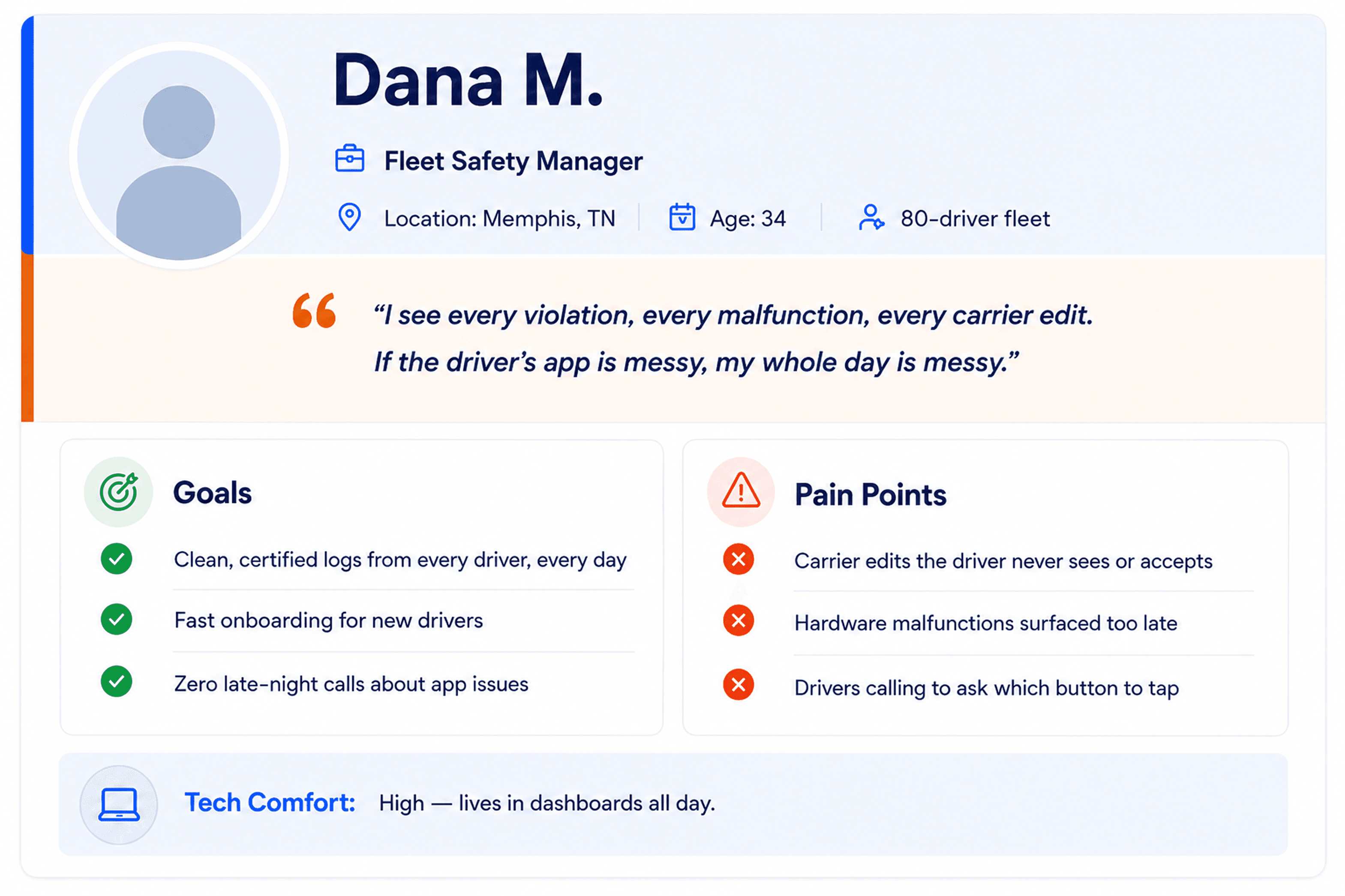
Two primary personas were defined from the interview findings. David represents the most-frequent end user — the driver in the cab, and the person whose comfort with technology shaped almost every decision. Dana represents the secondary stakeholder — the fleet safety manager who owns the back office surface but depends on Marcus’s app staying clean

User Stories
User stories were written for each persona to anchor every design decision in a concrete need. The table below lists the highest-priority stories that drove the information architecture and the key flows.
Area | As a... | I want to... | So that... |
|---|---|---|---|
Home / HOS | OTR driver | see my remaining drive time the moment I open the app | I can plan my next break without thinking |
Duty Status | new OTR driver | see what each status code actually means right on the button | I can log correctly from day one without asking a dispatcher |
Duty Status | OTR driver | change my duty status in one tap from a six-tile grid | I can update my log without taking my eyes off the road |
Cross-Border | OTR driver | switch HOS rules with one tap when I cross a border I stay compliant without doing the math myself | I stay compliant without doing the math myself |
Inspector Mode | OTR driver | hand my phone to an officer and have the right view appear automatically | a roadside stop doesn't add to an already tense moment |
Violations | OTR driver | see what caused a violation and how to avoid it next time | I learn from mistakes instead of just being penalised |
Exceptions | fleet manager | see missing logs, carrier edits, and unidentified driving in one place | I can resolve compliance issues before they become fines |
Hardware | fleet manager | be alerted to gateway malfunctions and diagnostic events in real time | I can dispatch a fix before a truck loses logging capability |
Information Architecture
The sitemap was defined before any wireframing began, so that every feature in a feature-rich product had a logical home and the daily-use surface stayed sparse. The result is a four-anchor bottom navigation plus a central grid menu that holds the long tail.

Navigation Design Decisions
Home as the Single Source of Truth. Home surfaces the four pieces of state a driver must always see — active driver, current duty status, drive remaining, current HOS rule. Nothing else competes for that space.
Every Destination Is Named, Not Just Drawn. No part of the navigation relies on an icon alone. Every tab, every grid-menu tile, and every status carries a written word, because for a driver still learning the system an unlabelled icon is one more thing to decode.
Grid Menu for the Long Tail. Eighteen secondary features (TPMS, Trailer, Fuel, Repair, Roadside, Dashcam, Document, and others) live behind a single central button in the bottom nav. The daily surface stays uncluttered while every feature stays one tap away.
ELD Exception as a First-Class Surface. Carrier Edits, Missing Logs, Unidentified Driving, and HOS Violations are not buried under Settings — they sit in the bottom nav with a numeric badge, because resolving them is a daily activity, not an edge case.
Inspector Mode as a Mode, Not a Page. Roadside Inspection lives under Share Log because a roadside stop is a different mode of use, not just a different screen. The whole interface flips when it is entered.
User Flow Diagrams
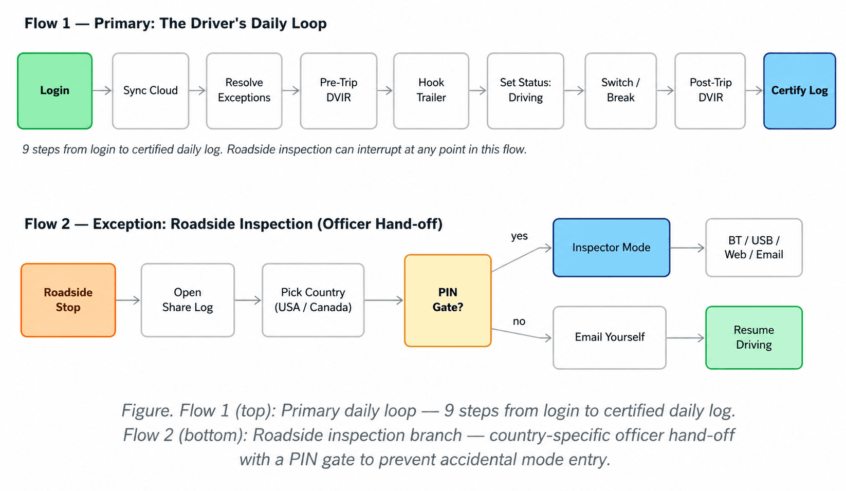
Two flows did the most design work on this project: the daily loop a driver runs every shift, and the roadside-inspection branch that can interrupt that loop at any point. Both were mapped end to end before wireframing began.
Flow Design Notes
The daily loop has nine explicit steps, but the driver consciously initiates only three or four. Sync, exception resolution, and post-trip transitions are nudged automatically — the app does the work wherever it can, so the driver has less to remember.
The PIN gate before Inspector Mode emerged from testing, not from spec. An early prototype let a single tap enter Inspector Mode; one driver triggered it accidentally during normal use. The PIN gate added 1.5 seconds and eliminated every false positive.
Roadside inspection is an interrupt, not a destination. The flow saves driver state on entry and restores it on exit, so the driver never loses their place in the daily loop because of a stop.
Country selection is the first decision in the inspection flow, not a setting. DOT and CVSE expect different document layouts and transfer protocols; surfacing this upfront prevents a mid handoff correction.
Low-Fidelity Wireframes
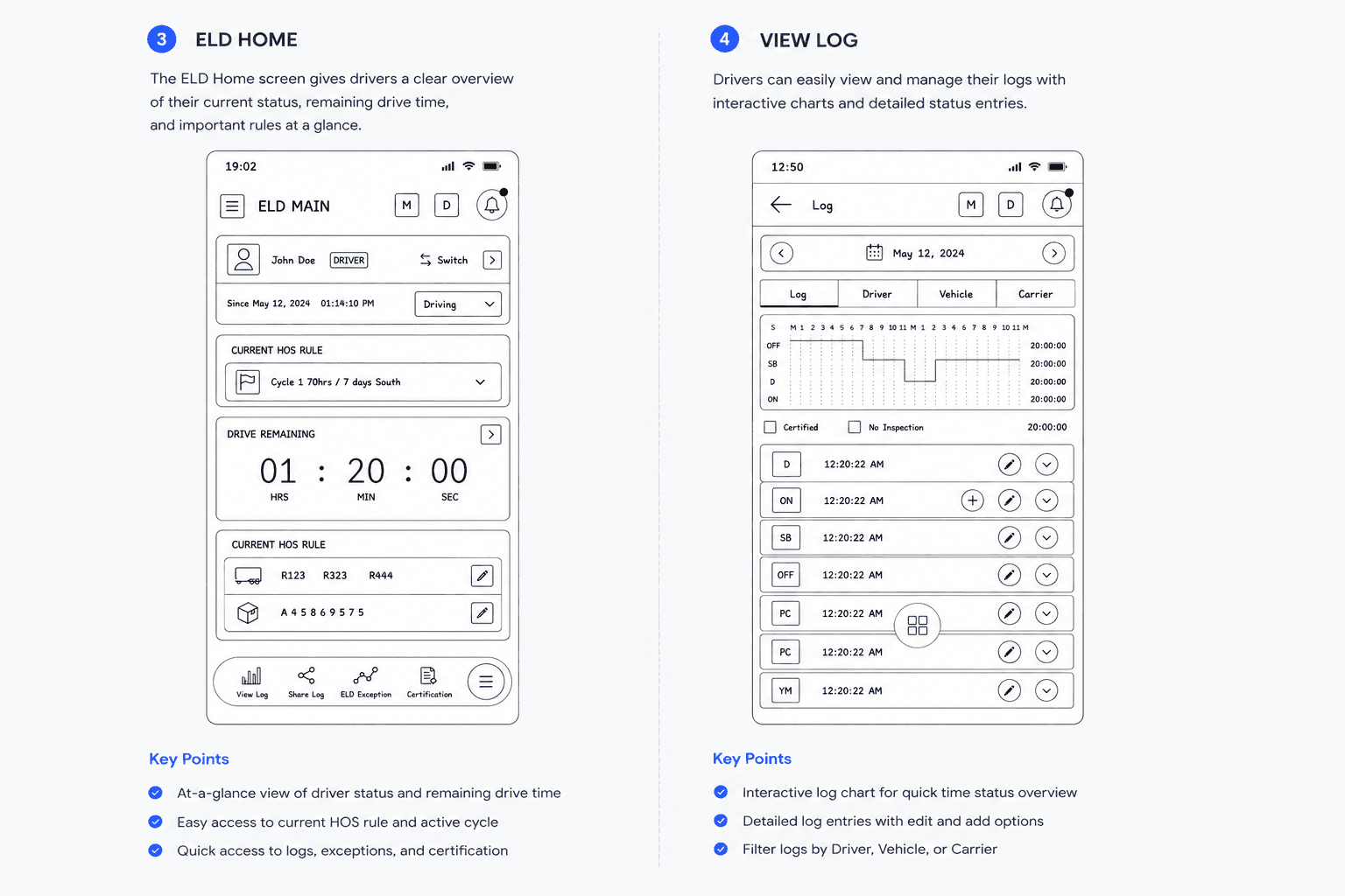
Low-fidelity wireframes were built in FigJam to validate layout, content hierarchy, and navigation structure before any visual design was applied. Three rounds of internal review resolved the structural questions before high-fidelity work began.

Wireframing Principles
Glance-First Hierarchy. Every screen has one piece of information that must be readable in under a second. On Home it is drive remaining; on Duty Status it is the current status. Everything else organizes around that anchor.
Plain Language Specified Early. The wireframes carry bare status codes as structural placeholders, but review flagged what the research had already shown — a bare code is not a label for a driver still learning the trade. The decision to pair every code with its full word (D — Driving, SB — Sleeper Berth) was written into the spec at this stage, to be carried through into the visual design.
One-Thumb Reach. Primary actions sit in the lower 60% of the screen, where a driver’s right thumb naturally rests. Destructive or irreversible actions are deliberately placed outside that zone.
The Schematic Beats the List. The TPMS screen went through three iterations — a numeric list, a table, and finally a truck schematic. The schematic is the only version a driver can read in half a second; a picture of the truck asks nothing of the driver that a table of numbers does.
Modes, Not Screens, for Inspections. The Inspector Mode entry was first designed as a screen, then a tab, and finally a destination tile alongside USA / Canada / Email / View Here — making the mental model “where am I sending this log?” rather than “what feature am I in?”
High-Fidelity UI Screens
The high-fidelity designs apply the full design system across 227 screens covering seven core flows. The twelve screens below are the most representative — they cover the daily loop, the hero flows, and the moments that differentiate the product.


Key UI Decisions
Dashboard-First Architecture. Home is always the first screen on launch. The four pieces of must-know state are visible without any navigation.
Plain-Language Labelling. Every duty status, and every other piece of trade shorthand in the interface, carries its full word. The code is kept for the experts; the label is added for everyone still becoming one. It cost no extra taps and no extra screens.
Grid Menu Pattern for the Long Tail. Eighteen secondary features behind a single central button — the architectural decision that lets a feature-rich product still feel calm.
Inline Violation Remediation. Every HOS violation card carries its own mini-graph and a “How to Fix” affordance. Violations become learning moments instead of dead-end alerts.
Country-First Inspector Hand-Off. The first decision in a roadside inspection is jurisdiction, not protocol. This matches the officer’s expectation and prevents a mid-handoff format mismatch.
Design System
A consistent visual language was established before high-fidelity work began. The system covers colour, typography, spacing, components, and motion — and every decision was constrained by the cab, and by the driver using it.

Design Rationale
No Code Without Its Label. The content rule that runs through every screen: a federal shorthand code never appears on its own. OFF, SB, D, ON, PC, and YM each sit with their full word — D — Driving, SB — Sleeper Berth, PC — Personal Conveyance. The codes stay because experienced drivers and inspectors expect them and the logs are legally defined in them; the labels are added so a driver who is still learning never has to guess. The same rule governs comment presets, transfer protocol names, and exception types.
Dark-First Palette. Most drivers run their phone at night or in dim cab lighting. A deep teal-navy background reduces OLED smear during scrolling and protects night vision better than pure black or charcoal grey.
Bright Green Reserved for “Driving.” Status colours are deliberately desaturated, with one exception — the bright green of an active Driving status earns the brightest pixel on screen, because it is the most-checked piece of state in the product.
Yellow as Primary CTA. Yellow gives high visibility on dark teal without the alarm connotations of red, and is reserved exclusively for primary actions (SAVE, Confirm, Proceed). Red is reserved exclusively for malfunctions and violations.
Persistent M and D Chips. The red M (malfunction) and yellow D (diagnostic) chips hold permanent residence in the top-right of every screen. Hardware health is never out of sight.
Oversized HOS Numerals. The HOS countdown is the largest type element in the app — Inter Display Bold at 56pt — sized to be readable at arm’s length in a sunlit cab.
Motion Reserved for State Change. Nothing animates for decoration. The motion budget per screen stays under 200 ms. The cab is loud enough.
Outcomes & Impact
65%
Faster Status Change
5.2s → 1.8s per change
62%
Faster DVIR Completion
240s → 90s per inspection
2 Taps
Inspector Mode Entry
From any screen, any time
Stakeholder review and prototype testing across 8 drivers — 4 returning from initial research, 4 new — confirmed that the redesign addressed every primary pain point identified in research. The new drivers mattered most here: they tested the app with no prior exposure, and they were the ones the plain language decisions were really for. Drivers consistently rated the duty-status grid and the “How to Fix” violations flow as the two most impactful changes from their current ELDs, and cross-border drivers cited the one-tap cycle reset as a feature they had wanted for years and never had.
Impact by Feature Area
Home / HOS. Drivers could read remaining drive time in under a second at a glance — previously a 3–4 second task across competitors, owing to small type and dense layout.
Plain-Language Labelling. New-driver testers set the correct duty status on first use without asking what a code meant — the exact behaviour that, in research, had sent drivers to their dispatchers. Pairing each code with its word added no taps and no screens; it simply removed a question.
Duty Status. Status-change time dropped from 5.2 seconds to 1.8 seconds, with workflow-aware comment presets removing the need to type for the most common situations.
DVIR. Full pre-trip inspection time fell from roughly 4 minutes to under 90 seconds, via a guided station by-station walkthrough and NFC trailer scanning. Drivers reported actually completing the inspection rather than mass-tapping “OK” — a meaningful safety improvement.
Roadside Inspection. Inspector Mode is reachable in 2 taps from anywhere, with all four FMCSA mandated transfer protocols exposed at the same level. The PIN gate prevents accidental entry without adding meaningful friction during a real inspection.
HOS Violations. The “How to Fix” remediation flow was the single most-praised feature in testing. Drivers described it as the first time an ELD had treated them as someone trying to do the right thing.
Compliance Coverage. Full FMCSA Part 395 and Canada SOR/2019-165 compliance, including all four mandatory data-transfer protocols, the standardised 24-hour graph grid, and proper handling of malfunction and diagnostic events
What I Learned
Design for the user’s comfort, not the buyer’s. Most ELDs feel bad to drivers because they were sold to fleets. Once that gap was named, every decision had a clearer answer: when in doubt, side with the driver — and specifically, side with the driver who is least comfortable with technology.
The interface should explain itself. The highest-impact decision in the project was also the cheapest: pairing every duty-status code with its plain-language word. It cost no taps, no screens, and almost no design time, and it removed a whole category of “which button do I press?” calls. When users aren’t confident with technology, every unexplained abbreviation is a small barrier — so spell things out. The experts won’t mind; the beginners are quietly rescued.
Domain reading isn’t optional in regulated spaces. Reading FMCSA Part 395 and Canada SOR/2019-165 cover to cover was the single highest-leverage research activity. It killed two design directions early and unlocked a third — Inspector Mode as a true mode shift rather than a screen.
Calm is a feature. I kept catching myself adding helpful little touches — animations, copy, indicators — and removing them on the next pass. The app is better the less it does. Restraint took more discipline than ornament would have.
Show the truth, and the way out. The “How to Fix” pattern was the most-loved feature in testing, and it cost almost nothing to design. When you deliver bad news, you owe the user a path, not just an alert.
Test in context, not just in a usability lab. The most useful session of the whole project was twenty minutes in a parked truck with a cooperative driver. The cab told me things no video call would have — including that my original Inspector Mode entry was triggering accidentally during normal use.
Next Steps
Telematics Integration Refinement. The status-change flow assumes the app knows when the truck is moving. The Gateway handshake needs hardening for edge cases — engine cranking but not running, idle versus driving thresholds, intermittent ECM dropouts.
Multi-Language Support. A meaningful share of North American drivers are Spanish- or Punjabi first. Plain-language labelling only does its job if the language is one the driver actually reads; the design system is type-tested for both, but copy and reading order need a real localisation pass.
Fleet Manager Companion App. Dana was scoped out of this project on purpose. She deserves her own surface — a back-office product designed for dashboards, not a tab inside the driver’s app.
Predictive Compliance. The “How to Fix” pattern is reactive. The next evolution is predictive — surfacing a warning 30 minutes before a likely violation, with a recommended action that prevents it entirely.


Let’s build meaningful product experiences together
© 2026 Arun Ashokk. All rights reserved.
Designed with clarity, usability, and accessibility in mind
Senior Product Designer
Let’s build meaningful product experiences together
© 2026 Arun Ashokk. All rights reserved.
Designed with clarity, usability, and accessibility in mind
Senior Product Designer
Let’s build meaningful product experiences together
© 2026 Arun Ashokk. All rights reserved.
Designed with clarity, usability, and accessibility in mind
Product Designer